On Track
Shanghai Metro Verification App
Not a navigation app — a boarding verification app. On Track helps passengers confirm they're on the right train before it's too late, solving the last-mile uncertainty moment on Shanghai's sprawling metro network.


Project Snapshot
Problem & Research
Route Known, Boarding Still Uncertain
Shanghai Metro Line 2 runs east-west across the city — two directions, identical platforms, easy to board the wrong train. The real problem isn't not knowing the route. It's the uncertainty that happens after the route is already known.
Metro apps tell you where to go — but not whether the train arriving right now is actually going the right direction. On a busy platform, this ambiguity causes missed trains, wrong boardings, and unnecessary anxiety — especially under time pressure.
International visitors or new riders using Shanghai Metro under time pressure. They may know the route but can't quickly interpret Chinese station signs, train terminal displays, or platform direction cues.
The riskiest moment is not route planning — it's real-time confirmation before and after boarding. Station signs, terminal directions, train displays, and language barriers must all be interpreted quickly.
Nodes 01–02 are where existing navigation apps excel. Nodes 03–06 mark the verification gap — the moments no existing tool addresses clearly. On Track is built entirely for this zone.
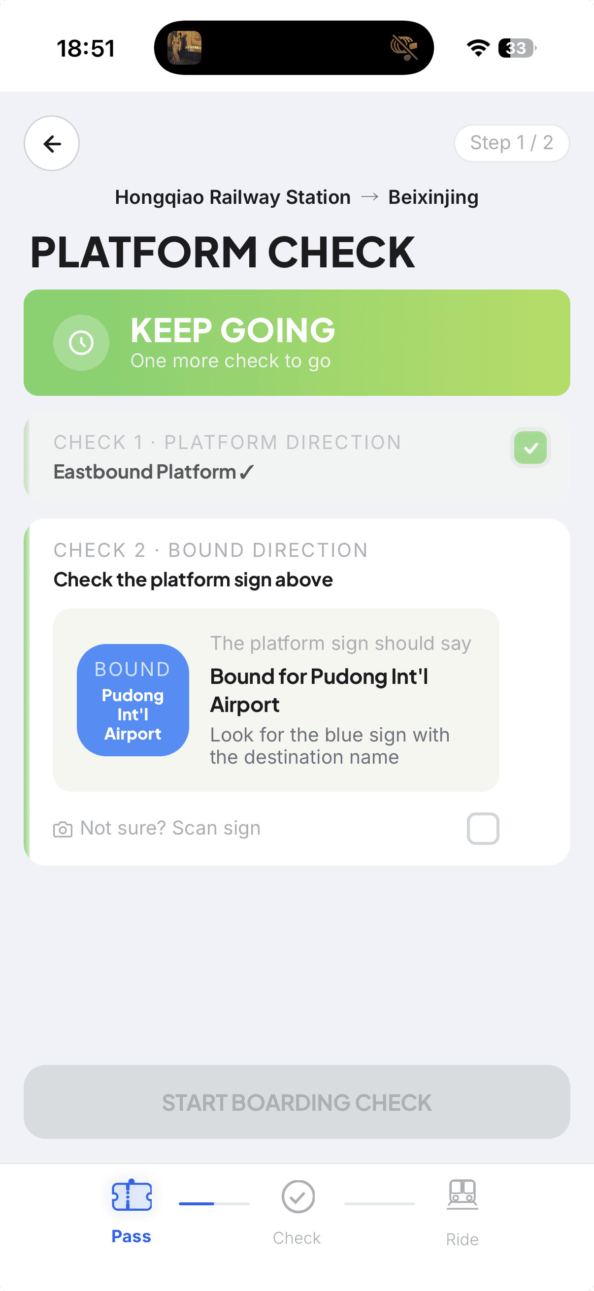
"EASTBOUND" without terminal context caused disorientation — first-time users don't know which way is east.
Terminal station name added as primary wayfinding cue. "Not sure? Scan sign" added as a language-barrier fallback.
Experienced transit users tend to scan rather than read — skipping CHECK 2 before CHECK 1 was confirmed.
Sequential lock: boarding destination only unlocks after line number is confirmed. Order enforces attention.
"Something doesn't look right?" had the lowest visual weight in the flow but sits at the highest-consequence moment.
Large status labels dominate each screen — status is readable before layout is parsed. Error trigger given subtitle for discoverability.
Chinese station names on real train displays are unreadable for most international users.
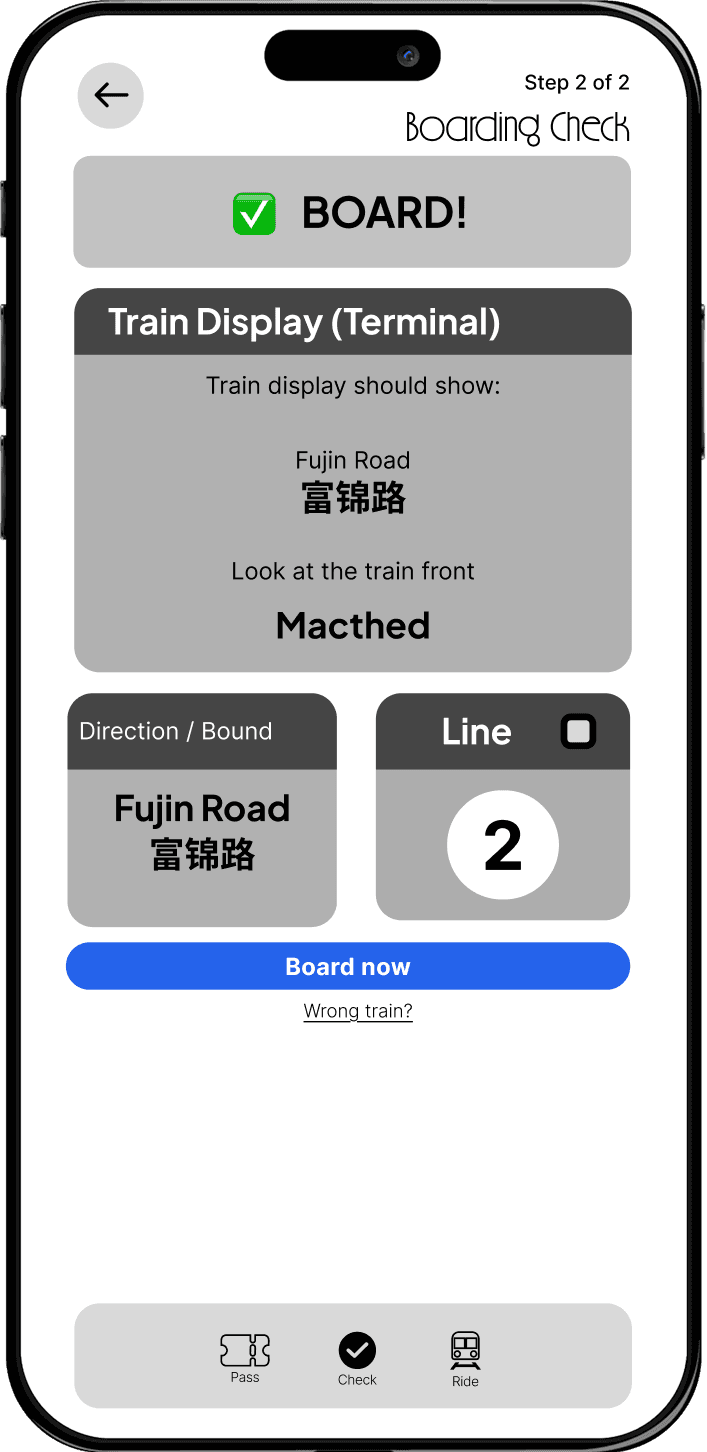
All station names shown bilingually (English + Chinese) in Ride Mode — users can match what they see on the train.
Route planning anxiety is already resolved before users arrive at the platform.
Route planning removed entirely. On Track starts at the platform — narrowing scope sharpened every screen's purpose.
Instead of replacing navigation apps, On Track focuses on the last-mile verification moment: "Am I on the correct platform?" "Should I board this train?" "Am I still going the right way?" — three questions no existing app answers clearly.


User Flow & Decision Logic
Verification, Not Navigation
The flow is not a linear checklist — each step answers a specific user question with a binary outcome. The key design decision was separating static environment verification (Platform Check) from dynamic train verification (Boarding Check), because they require different information and carry different anxiety.


Design System
Designed for Confidence
Every system decision was evaluated against one question: does this reduce user anxiety or increase it? The goal was a UI that delivers instant, unambiguous status — not a visual showcase.

Dark green ticket stub (#1A3A2A) with barcode, tear-line, notch cutouts, and Valid badge — a physical transit metaphor that gives users instant orientation.

Pass → Check → Ride with animated connector lines, driven by useLocation() per route. Gives users a continuous sense of progress without extra cognitive load.
Iterations
What Changed & Why
The final design is not the first design. Three key shifts shaped the difference between a UI demo and a UX tool.
Earlier version tried to behave like a navigation app — it offered routing, station search, and line maps.
Final version narrowed to verification only. By removing route planning entirely, every screen could focus on the one moment that mattered: "Am I in the right place right now?"
Earlier platform check mixed static signs and dynamic train display into a single confirmation step.
Final version separated Platform Check (static, environment) from Boarding Check (dynamic, train). These are different anxiety points requiring different information — combining them created confusion.
Earlier success states overused green CTAs throughout the interface — buttons, labels, and confirmations all appeared in green.
Final version reserved green exclusively for verified status and coral for error states. No green buttons — active actions are blue. Color became a signal, not decoration.
Failure States & Recovery
Designing for Misverification
Designing for failure states is as important as the happy path. On Track handles four distinct misverification scenarios, each with a clear exit path — because the cost of a wrong boarding is real time lost.
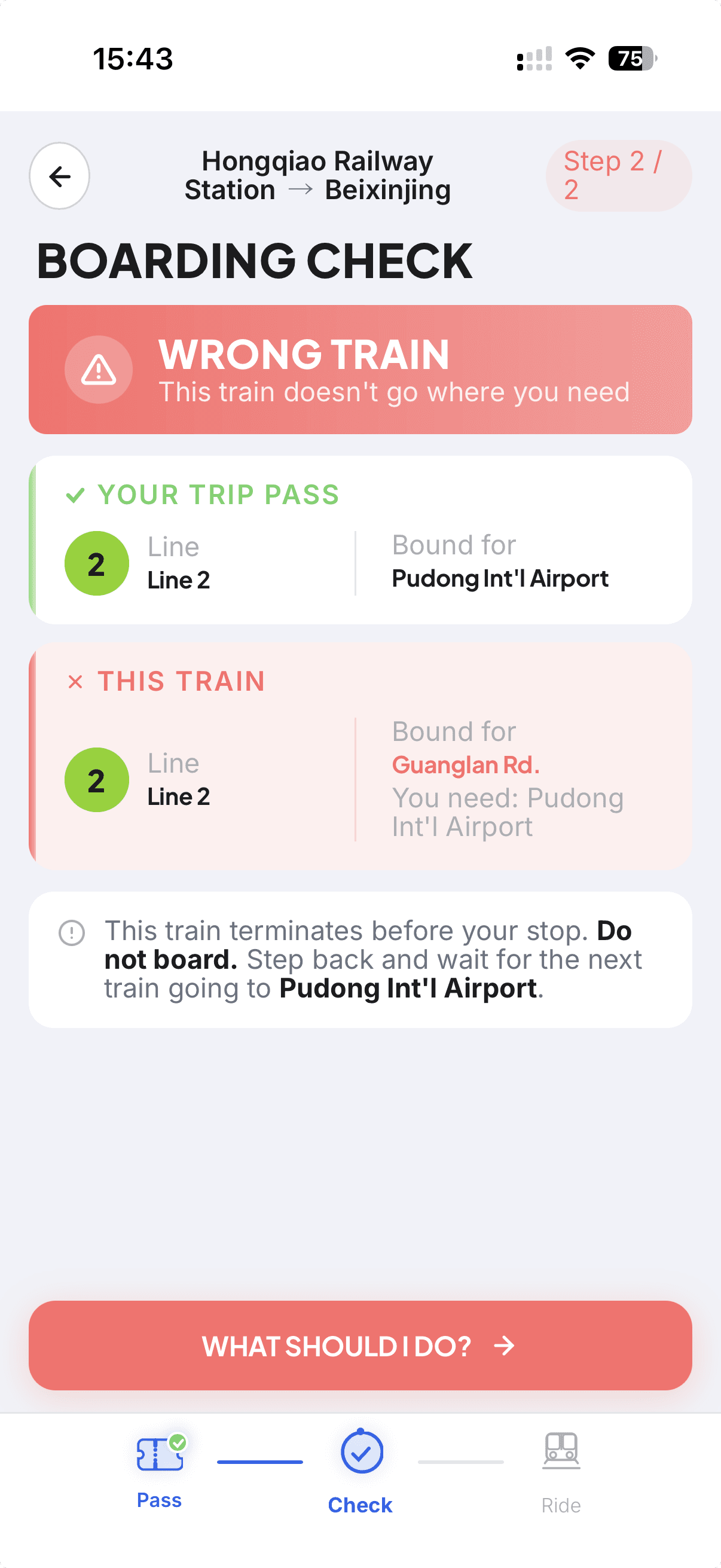


No green CTAs — color is reserved for status meaning. Active buttons are blue (primary action) or gray (inactive). Green only appears in the verified state, coral only in error states, making status instantly readable under time pressure.
Outcome & Takeaway
A mobile web prototype that reframes metro assistance from route planning to moment-by-moment verification — a tool built around the highest-anxiety decision points in a transit journey, not the easiest ones to design for.
Good UX is sometimes about reducing scope. By deciding not to become another navigation app, On Track could focus entirely on the one moment no existing tool handles well. Narrowing the problem made the design better.