Book Cover Redesign · 2025

The Three-Body
Problem

Liu Cixin

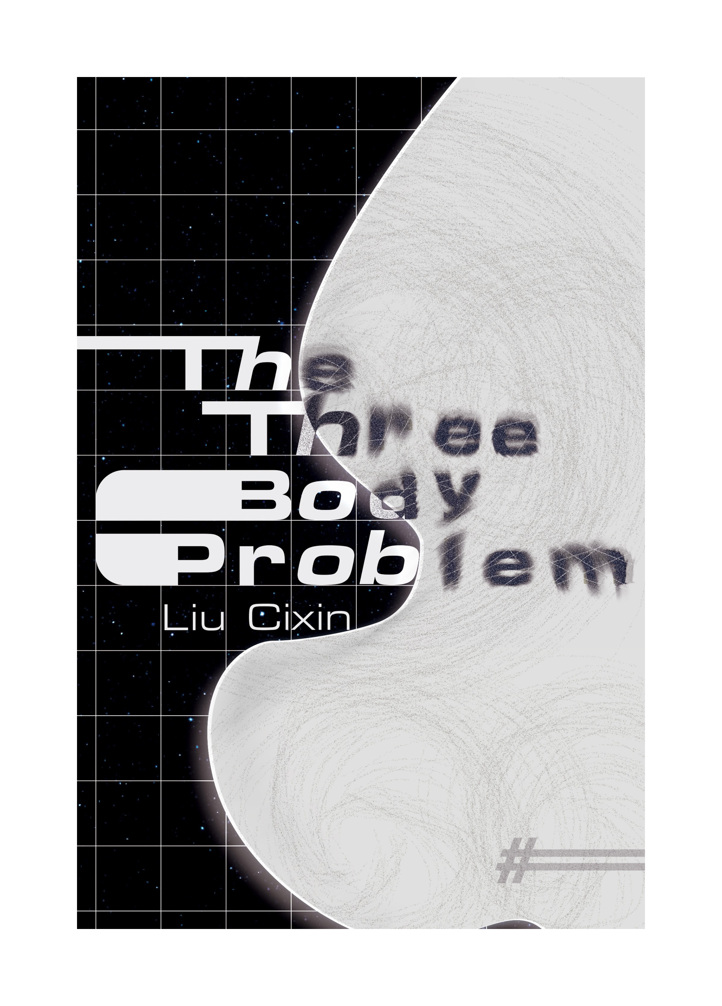
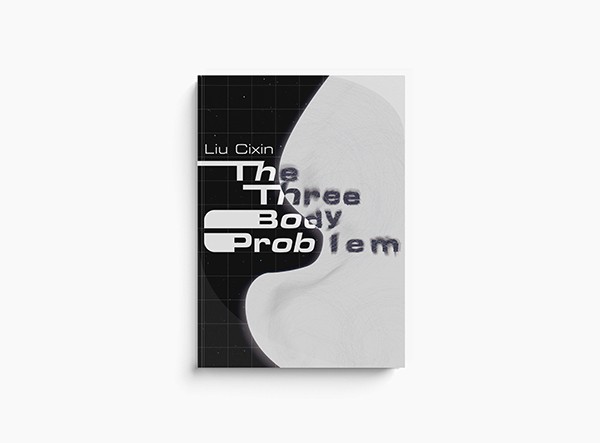
A typography course project. Rather than depicting planets and spacecraft, the cover builds its argument from grid, typeface, and the visual boundary between order and chaos.

Course
Typography
Year
2025 · RIT MFA
Tools
Illustrator · Figma
Typeface
Eurostile Extd Black
Book cover
Scroll
Project Brief

Beyond the Spacecraft

The brief challenged assumptions about science fiction cover design. Rather than relying on photorealistic space imagery, the goal was to build a visual system that communicates the novel's conceptual core — the tension between scientific rationality and fundamental unpredictability — through typography, grid structure, and abstract form alone.

01

Avoid conventional sci-fi imagery: planets, spacecraft, photorealistic space

02

Build the visual system from typography and grid — the cover IS the argument

03

Balance experimental form with commercial readability at thumbnail scale

04

Eurostile Extended Black as the structural typeface — geometric, wide, technical

Existing Cover Research

Four Editions, Four Approaches
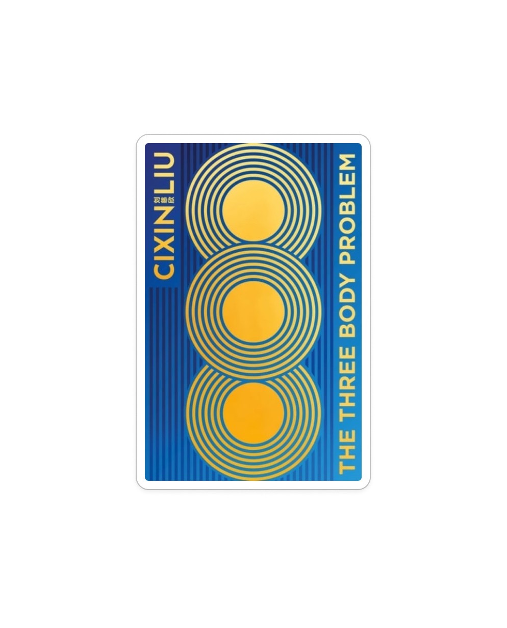
Original Chinese Edition
Traditional sci-fi aesthetic; heavy use of gradients and lighting. Typography subordinate to imagery.
Tor Books (US Edition)
Modern sans-serif in the Eurostile tradition. Clear and readable, but visually predictable.
Korean Edition
Korean Edition
Striking grid-based composition. Interesting typographic rhythm, but legibility suffers.
Head of Zeus (UK Edition)
Minimalist and elegant. Typography almost secondary to the abstract imagery.
Concept Development

Three Directions

Initial exploration produced three distinct conceptual directions. Only one could be built into a coherent visual system rather than a single illustration.
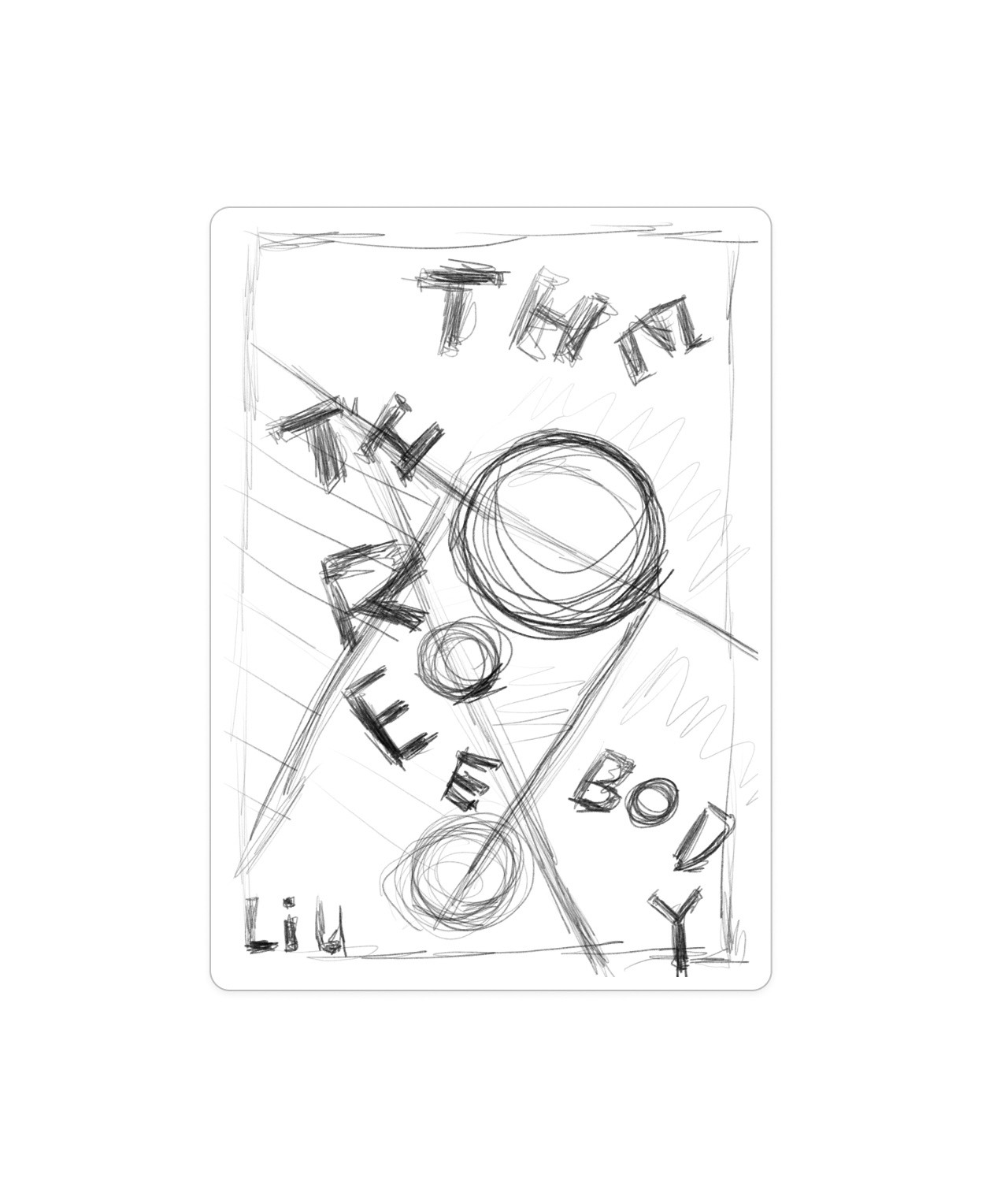
01
Human Fragility at Cosmic Scale
Eyes, observation, the smallness of the individual against a vast and indifferent universe. Visually compelling but difficult to systematize — too dependent on a single image.
Selected
02
Tension Between Order and Chaos
Grid as rational system. Organic form as the uncontrollable. Typography as the element that gets caught between the two. This direction could be built into a complete visual language — not just one image.
03
Gravity
Letterforms pulled, distorted, and dragged by gravitational fields. Interesting typographic experiments emerged, but the concept required too much literal illustration to work as a book cover.
Sketches

Early Exploration

Grid invaded by line mass
Black-white space conflict
Fragmented letterforms
Typographic distortion
Orbital / gravity direction
Typography & Visual System

Order Has Rules. Chaos Does Not.

Every visual decision maps to the conceptual opposition. The grid encodes the rationality of human science. The organic form encodes the cosmic force that cannot be measured. Typography sits at the boundary — legible in the ordered field, distorted as it enters the chaos zone.

VISUAL SYSTEM — THE THREE-BODY PROBLEMTYPOGRAPHY COURSE · RIT · 202501 TYPEFACEAaEUROSTILE EXTENDED BLACKGeometric · Wide · TechnicalMaximum weight→ Rationality, science, ordered systems02 GRID SYSTEM24px module · Stroke 0.5pt @ 7%Star field scattered across dark zonePresent only in ordered (dark) field→ Encodes the rationality of human scientific knowledge03 COLORORDER FIELD#080808CHAOS FIELD#E4E4DCGRID LINES#FFF @ 7%→ Binary palette only. No additional colour. Opposition is absolute.04 DESIGN RULESGrid always present in dark field.Invisible where chaos dominates.Chaos form crosses the grid boundary.It is not contained by the system it invades.Title always begins in the dark field.Letters entering chaos become dark + distorted.Typography readable at 150px.Distortion is partial — chaos disturbs, not erases.No additional colour.Binary palette only — black and off-white.
04 — Chaos Form
04 — Chaos Form
05 — Title Treatment
Typeface
Eurostile Extended Black — maximum weight, geometric, technical. Represents the rationality of measurable systems.
Grid
20px module, 7% opacity. Present only in the dark (ordered) field. Invisible where chaos dominates.
Chaos Form
Amorphous boundary, concentric internal texture. No fixed geometry. Crosses and disrupts the grid.
Color
Binary palette only. Black #080808 (order field) and off-white #E8E8E2 (chaos field). No additional color.
Title Zone
Title begins in the dark field (white, legible) and enters the chaos form (dark, distorted). The boundary is the conceptual threshold.
Rule
Typography must remain identifiable at 150px width. Distortion is partial, not total — chaos disturbs order, it does not erase it.
Key Iterations

Three Stages

Each revision made the system more restrained. Decoration was removed until only the essential opposition remained.

Early Draft
Early Draft
Composition established but overly complex — multiple textures and hand-drawn elements competing. Needed reduction.
Refined
Refined
Reduced decoration, strengthened the black/white structural split. Typography hierarchy clarified.
Final
Final
Chaos form simplified to a single amorphous mass. Grid remains only in the dark field. Typography distortion controlled.
Final Design

The Three-Body Problem

Front cover
Front Cover — Flat
Book mockup
Book Mockup
Note 01
The grid exists only where order dominates — the dark, measured field of human scientific knowledge.
Note 02
The chaos form crosses the grid boundary without following it. It is not contained by the system it invades.
Note 03
Letters that enter the chaos field lose their crispness — absorbed, darkened, made unstable by what they cannot be part of.
What Shifted

The project started with questions about what The Three-Body Problem looks like — planets, cosmic scale, the Cultural Revolution. It ended with a different question: what does the novel's central argument feel like? The shift from image to system was the central design decision.

What I Learned

Typography can be a structural and conceptual system, not just a vehicle for text. When a typeface is placed at the boundary between two visual fields with opposing properties, the type itself becomes part of the argument — not a label applied to an image, but a participant in the tension it describes.

The Three-Body Problem · Book Cover Redesign